REX — Social Shopping Assistant
About the Project
REX is a social shopping assistant that connects users with their friends and trusted networks to discover, organize, and get feedback on fashion items across the web. The core concept was built around a simple human insight: people rarely shop in isolation. They text screenshots to friends, share wishlists, and seek opinions before buying. REX was designed to make that social layer a native part of the shopping experience rather than a workaround happening across multiple disconnected platforms.
I joined the REX UX team as UX Researcher and UI Designer on a cross-functional four-person team alongside a Project Manager and UI Designer, a UX Research Lead and Writer, and a Product and Visual Design Lead. Over the course of one month we took the product from a Chrome extension concept through a fully designed and tested mobile and web application, delivering a high-fidelity prototype, a complete style guide, and a documented design system in Figma.
What I Did
The project opened with a structured discovery phase. We conducted user interviews with participants across two primary user groups, Gen Z and Millennial shoppers, to understand how people actually shop online and seek feedback from their networks. Six recurring behavioral patterns emerged: users texted screenshots to friends for comparison, screenshotted items to remember them later, considered how items would fit with existing wardrobe pieces, expressed frustration with not knowing how items fit before buying, drew inspiration from influencers and brands, and wanted a direct way to see and purchase what influencers were wearing.
These insights shaped three distinct user personas and fed directly into journey maps, user flows, and two rounds of prototype testing. The design phase moved from hand-drawn sketches through two Figma prototype iterations, each validated through usability testing, before delivering a complete style guide and Zeplin handoff for the development team.
My role on the team
REX was a cross-functional UX team of four. I served as UX Researcher and UI Designer, contributing to user interviews, competitive analysis, and UI design across both prototype rounds. The team also included a Project Manager and UI Designer, a Product and Visual Design Lead, and a UX Research Lead and UX Writer.

Research methods
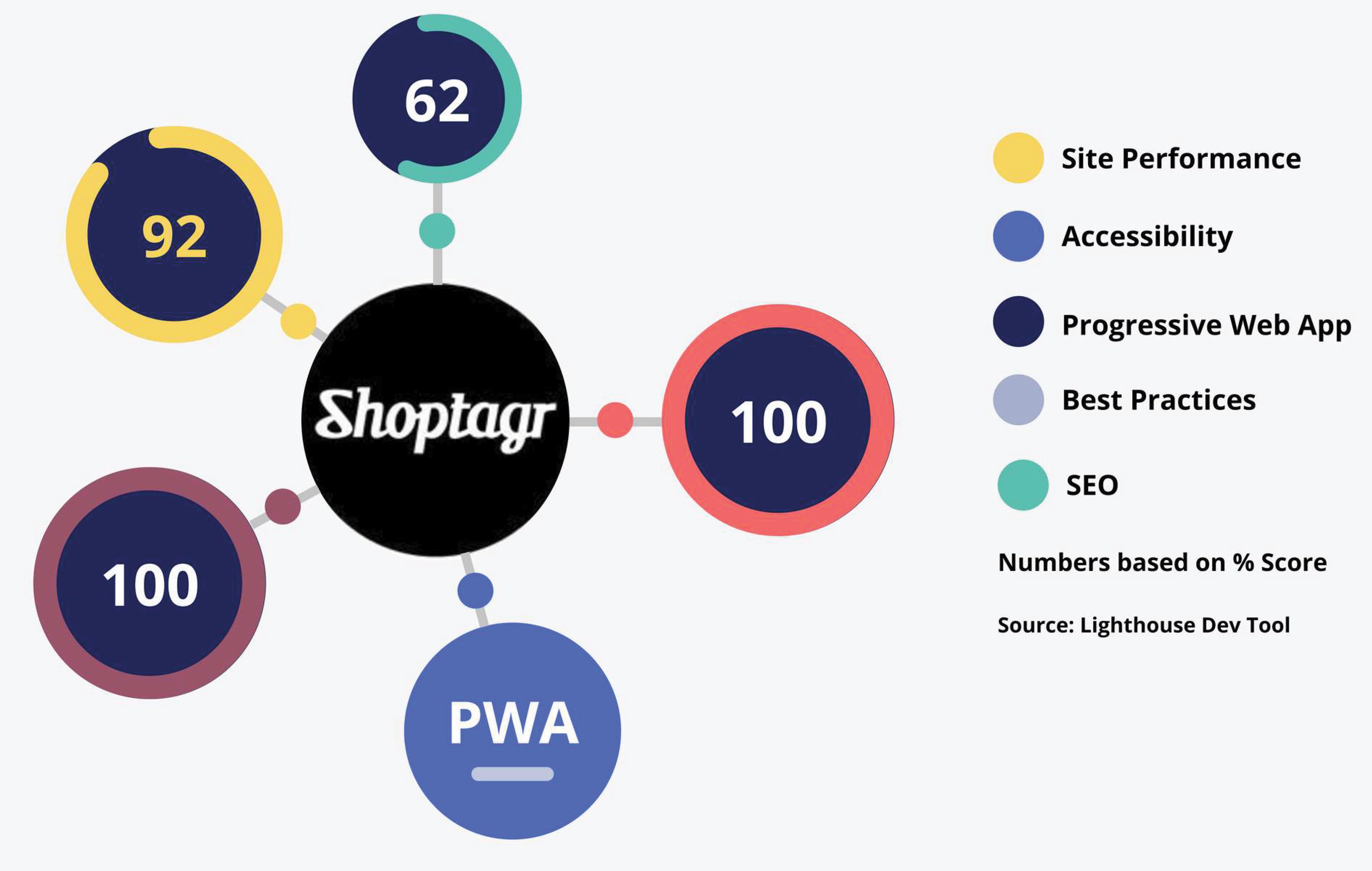
The discovery phase used six research methods in parallel: user interviews to surface real shopping behaviors and pain points, affinity mapping to cluster and synthesize findings, competitive analysis across seven direct competitors, heuristic evaluation of the existing Chrome extension, task analysis to map critical user flows, and a Lighthouse-based analytics review benchmarking competitor platforms on performance, accessibility, SEO, and best practices.
The core finding from user interviews was that people were already doing social shopping manually. REX had identified the right problem. The question was whether the solution could match how people actually behaved.
"I text message screenshots for comparisons"
"I consider how an item will fit with the clothes I already own"
"I want to see what influencers are wearing and where to purchase them"
"I don't like not knowing how it fits, that's major"
Personas and journey mapping
Three personas were developed from interview synthesis, each representing a distinct user type with different goals, behaviors, and friction points.
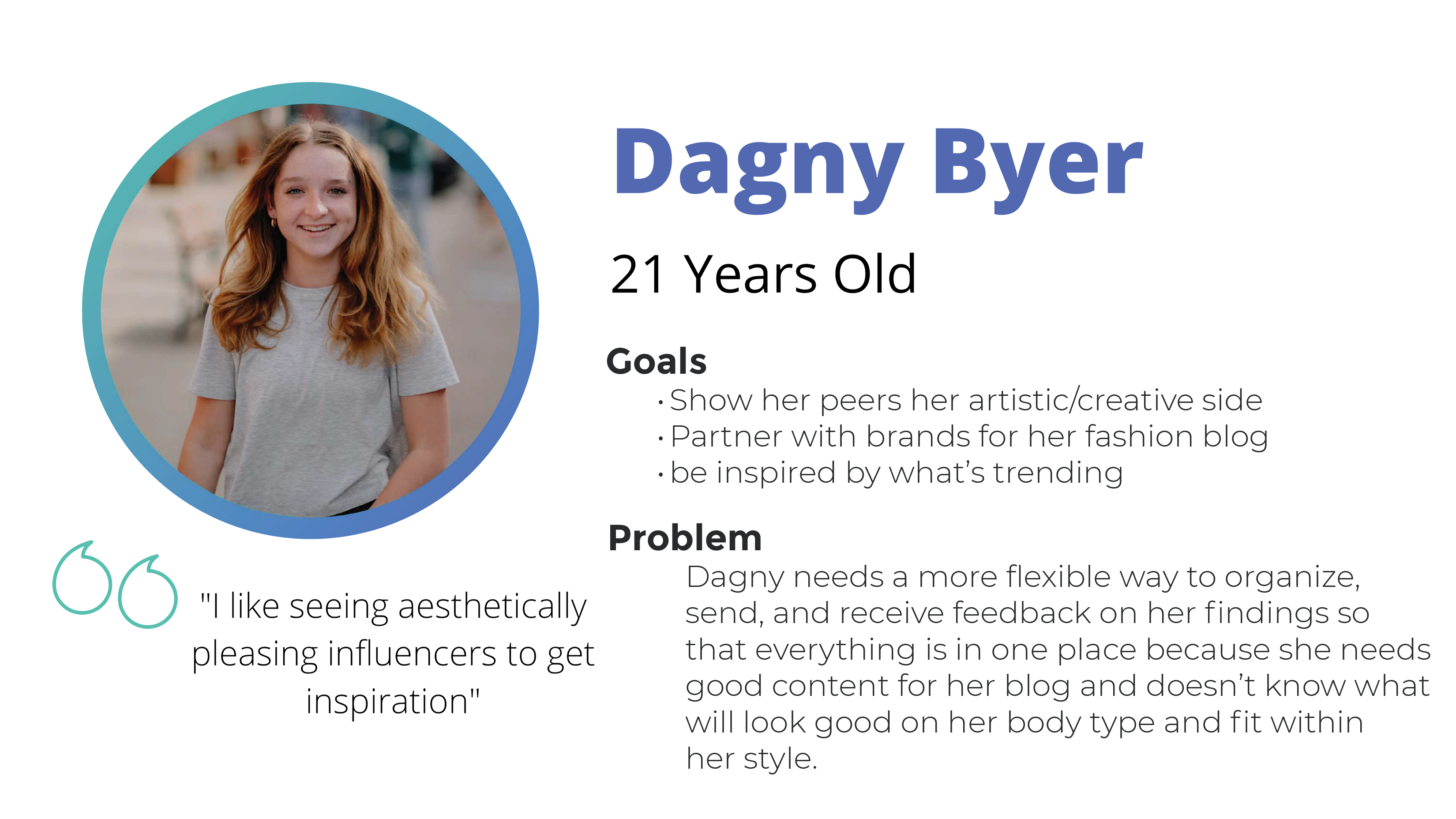
Dagny, 21, was a fashion blogger who needed to organize inspiration from multiple sources and get feedback from her network in one place. Her journey map revealed she was using notes apps, screenshots, and manual tracking just to manage her research process — friction REX could directly eliminate.
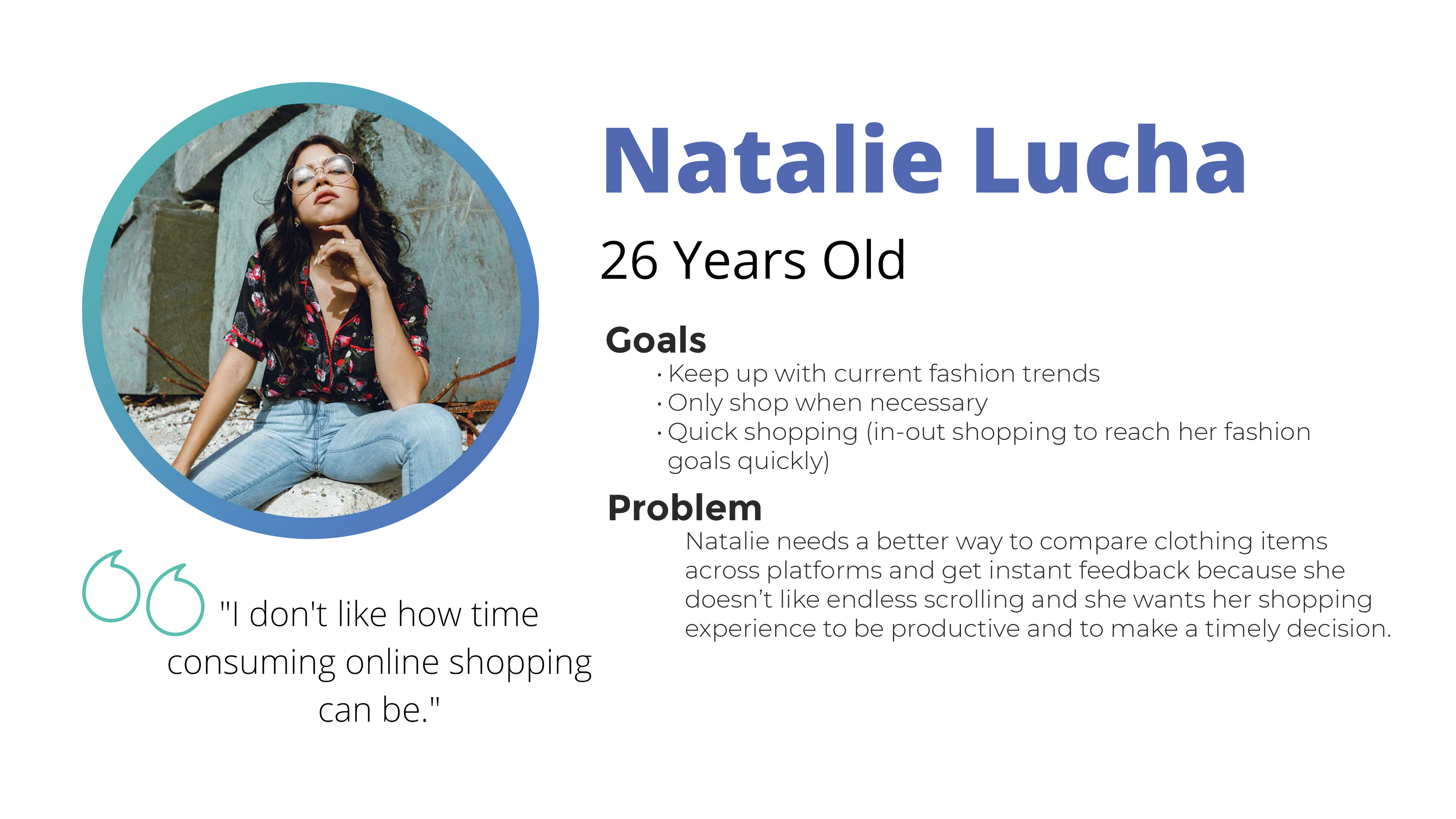
Natalie, 26, was a purposeful shopper who found online shopping too time-consuming. She needed fast cross-platform comparison and instant feedback without endless scrolling.
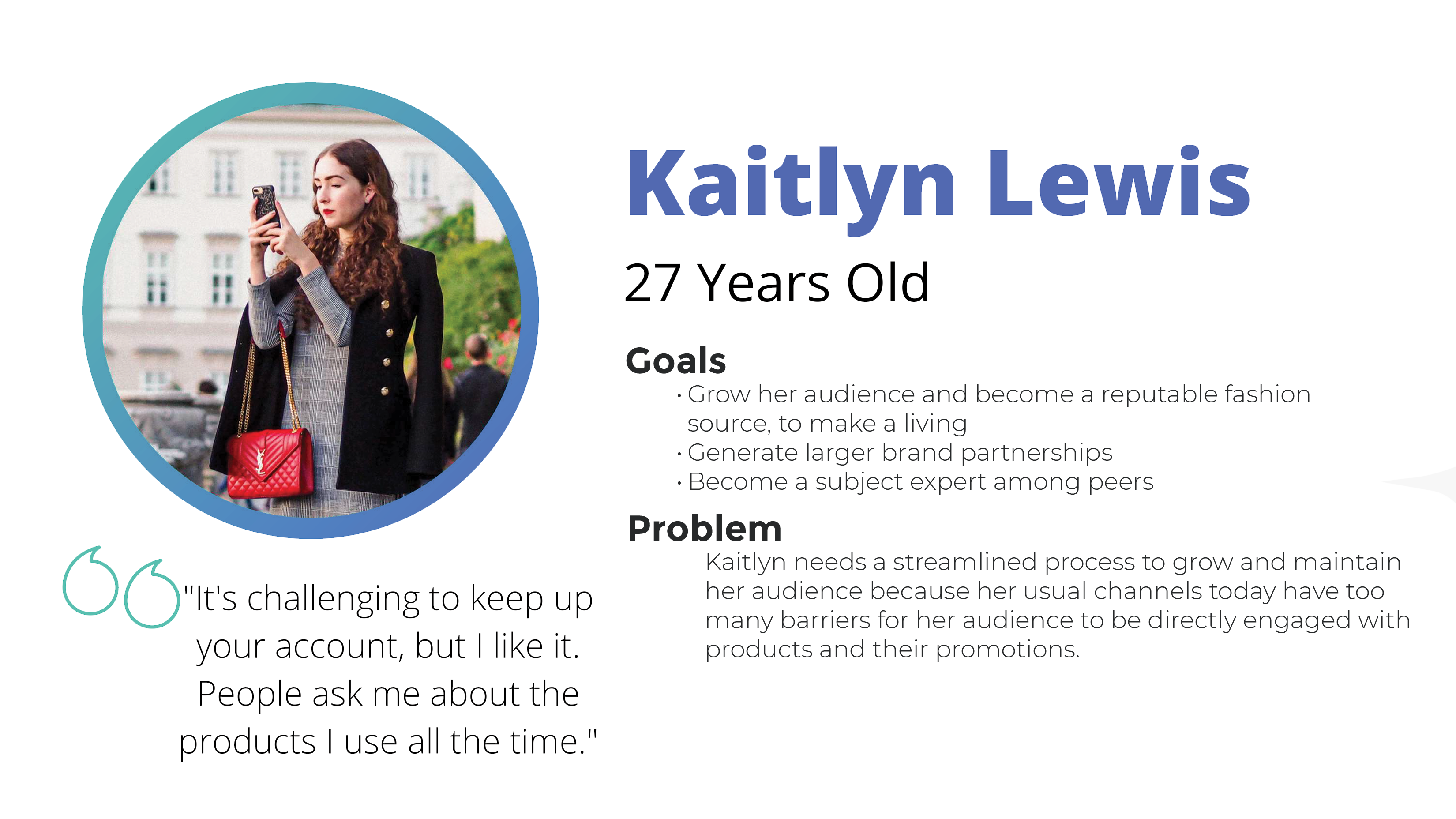
Kaitlyn, 27, was a fashion influencer trying to grow her audience and brand partnerships. Her primary barrier was that existing platforms created too many friction points between her content and her audience's ability to engage with and purchase the products she featured.
Competitive analysis
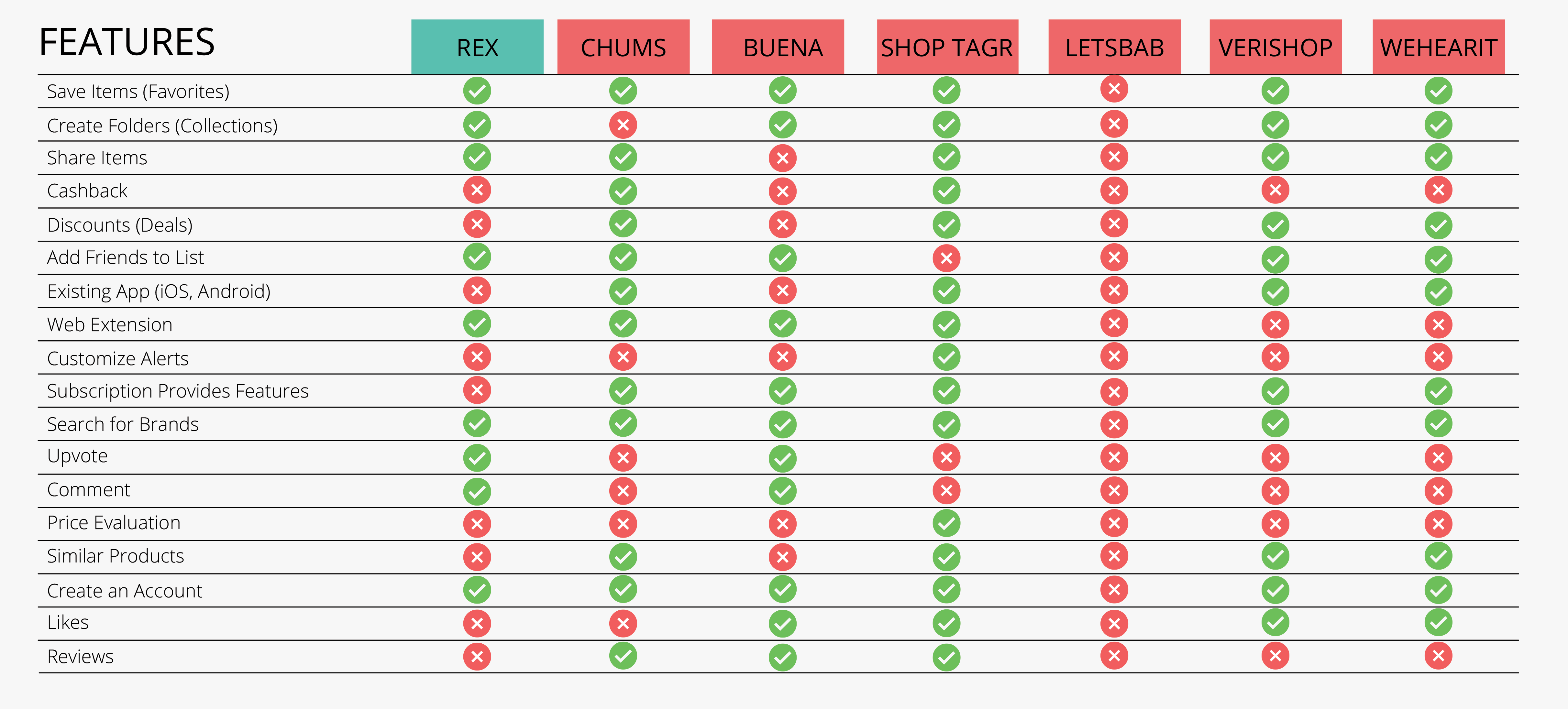
Seven competitor platforms were evaluated across 18 feature criteria including social sharing, collections, cashback, notifications, and browser extension availability. The analysis identified that no single competitor combined social feedback, cross-platform saving, and influencer tools in one product, validating REX's core positioning.
An analytics review using Lighthouse benchmarked two key competitors. Chums Referral scored 26 on accessibility, a significant gap REX could address by design. Shoptagr scored 100 on both Best Practices and SEO but only 62 on accessibility, showing that even the strongest technical performers in the space had accessibility blind spots.
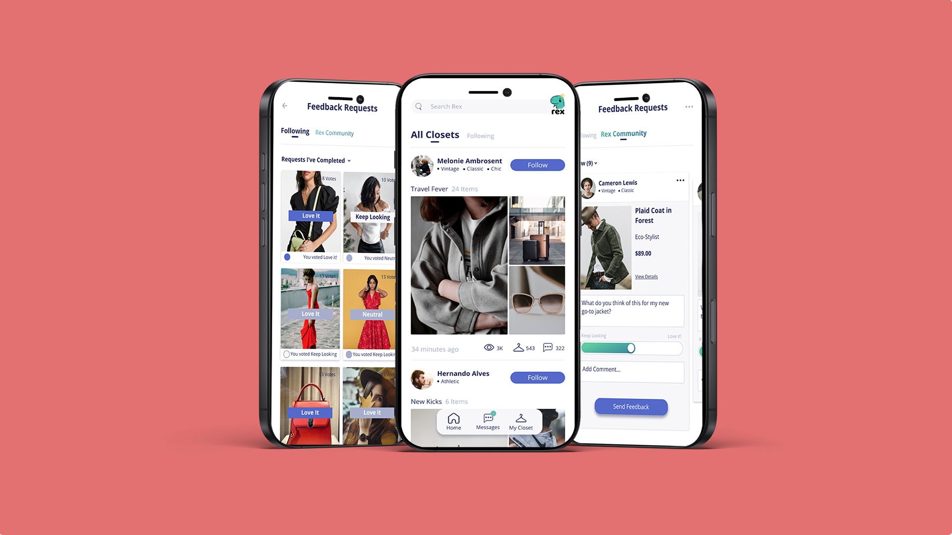
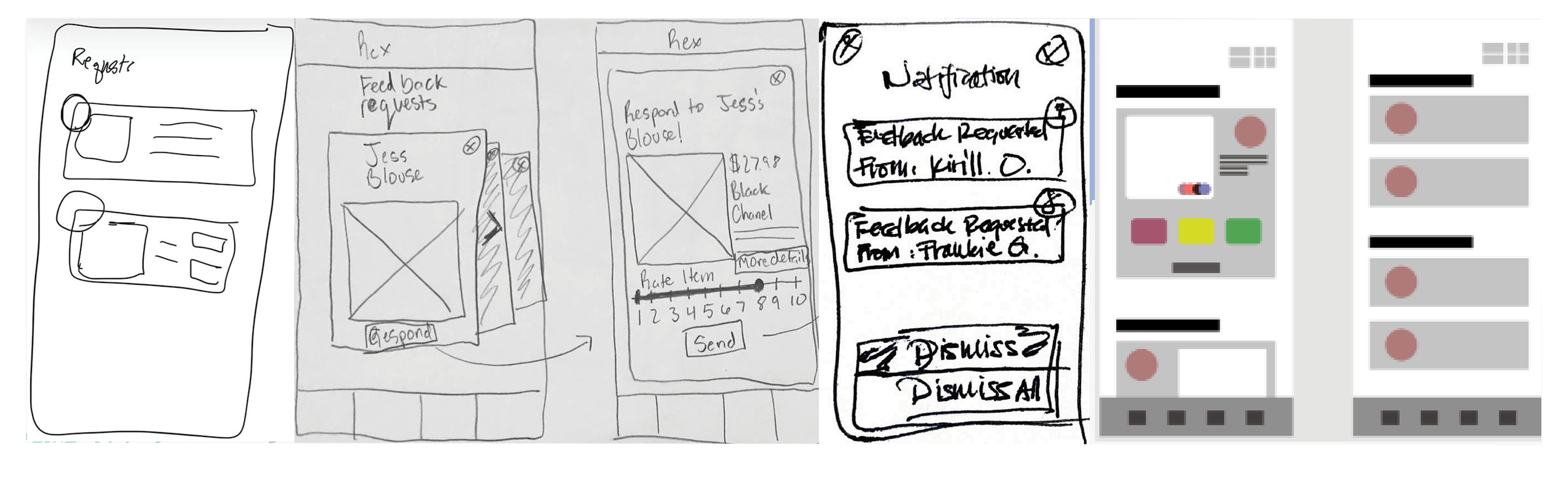
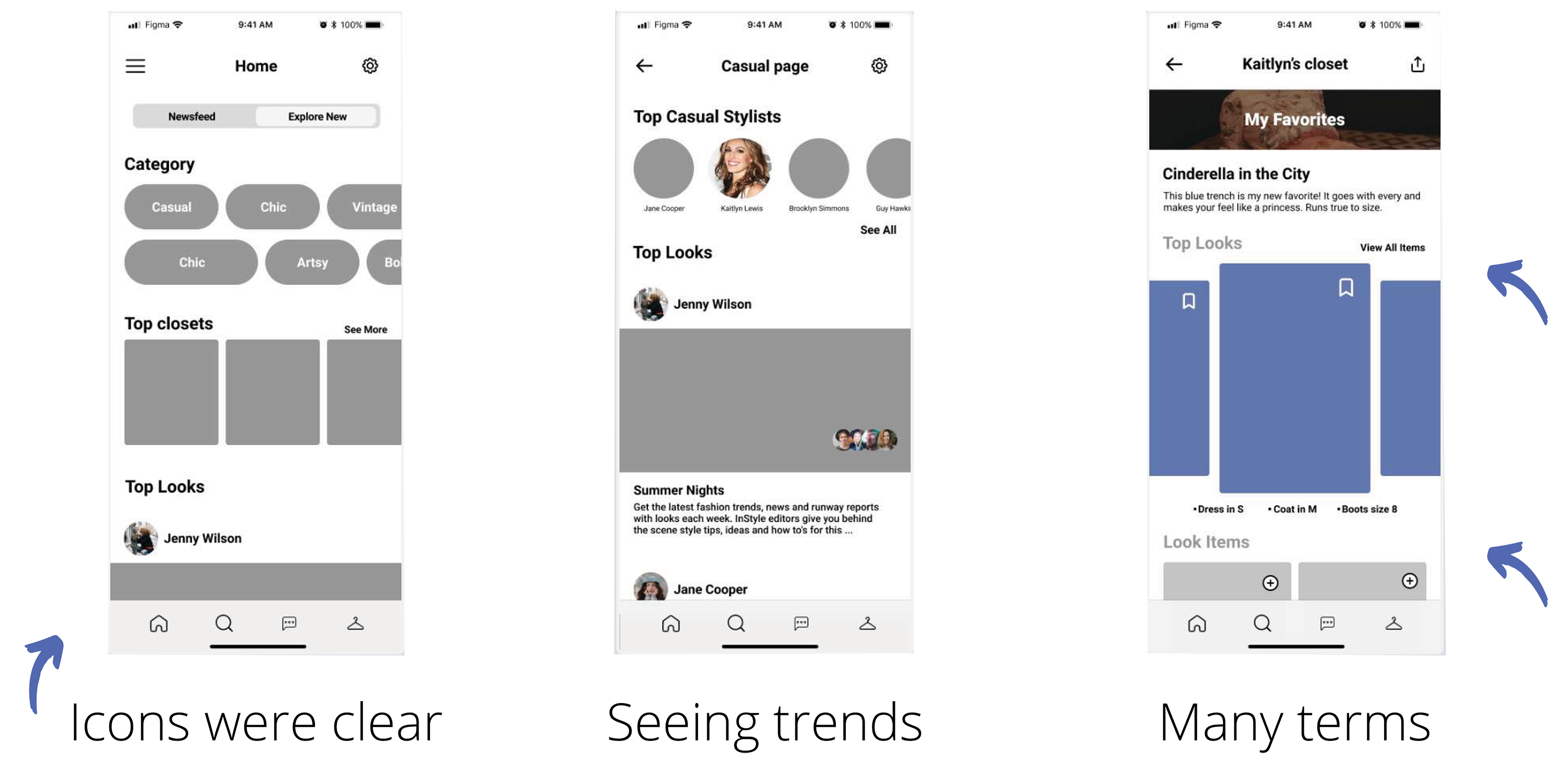
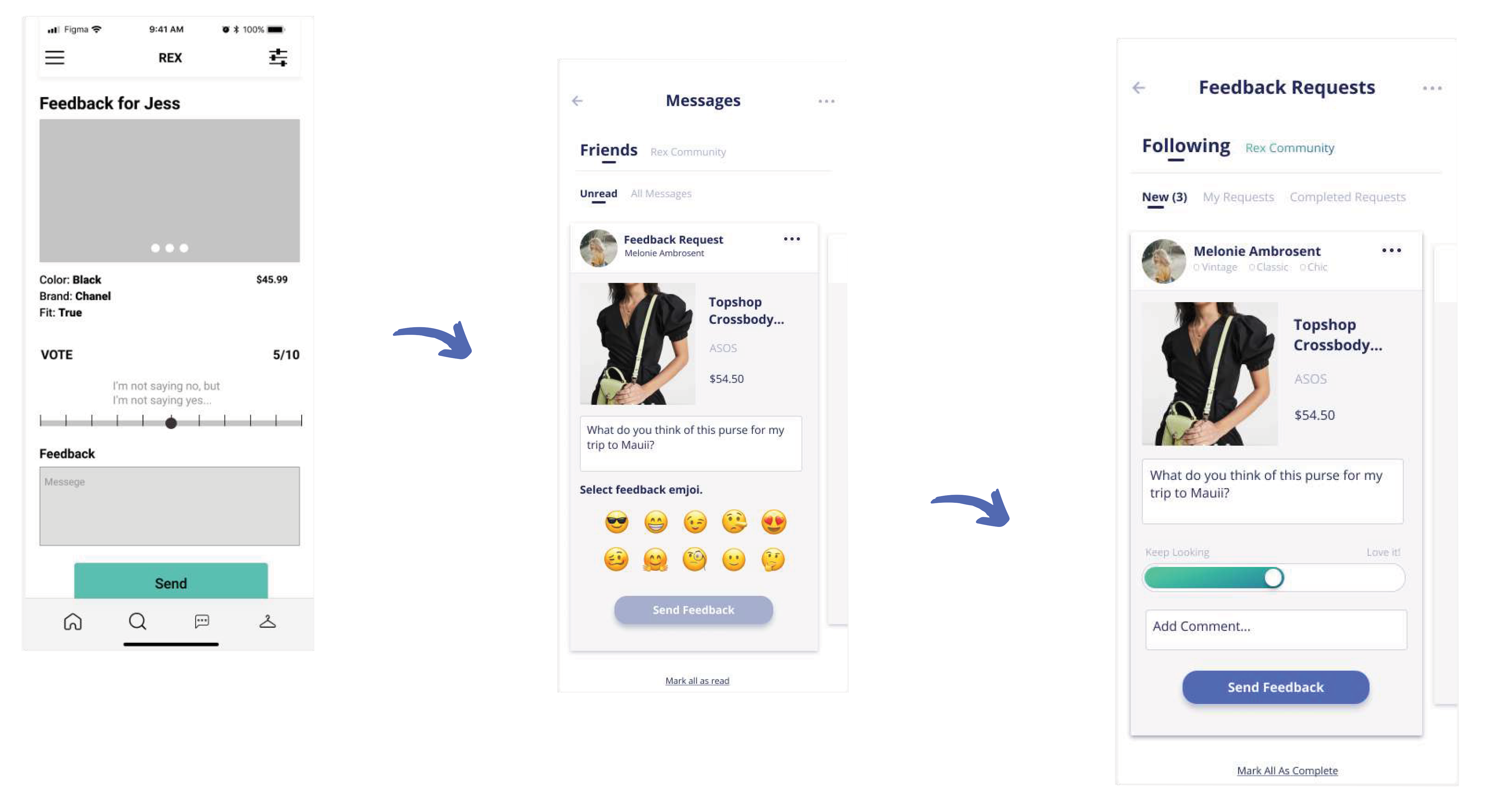
Prototype 1 and usability testing
The first prototype established the core navigation structure, home feed, category browsing, closets, and a feedback request flow using a 0-to-10 voting scale. Usability testing surfaced two primary concerns: users found it difficult to get their existing friends onto a new platform, and the numeric voting scale felt socially harsh when giving low scores. On the positive side, icons and navigation were validated as clear and intuitive, and the trend discovery feed resonated strongly with participants.
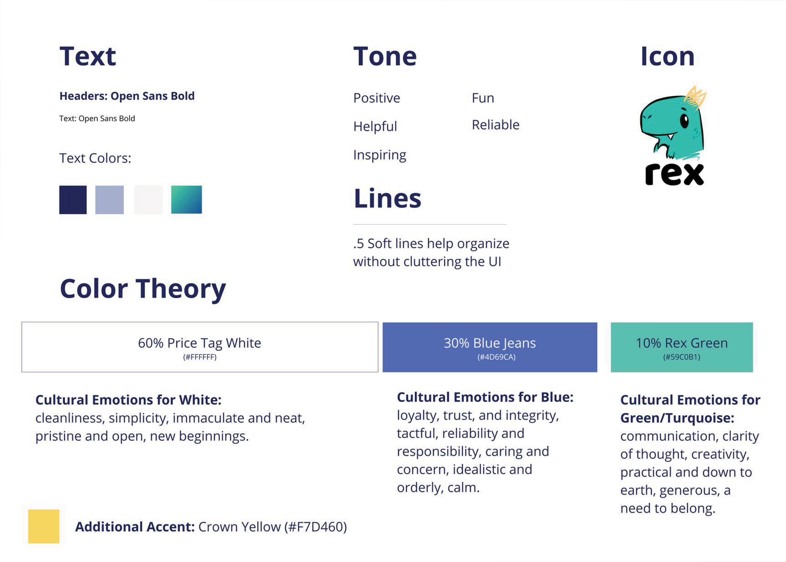
Style guide and design system
The final design system was built around three primary colors with intentional psychological grounding. Price Tag White at 60% established cleanliness and simplicity. Blue Jeans navy at 30% communicated loyalty, trust, and reliability. Rex Green at 10% added energy and creativity as an accent. Crown Yellow was defined as a secondary accent tied to the REX mascot and reward states. Typography used Open Sans Bold throughout for both headers and body text. Line weights of 0.5pt were used throughout to organize the UI without visual clutter. Brand tone was defined across five qualities: positive, helpful, inspiring, fun, and reliable.
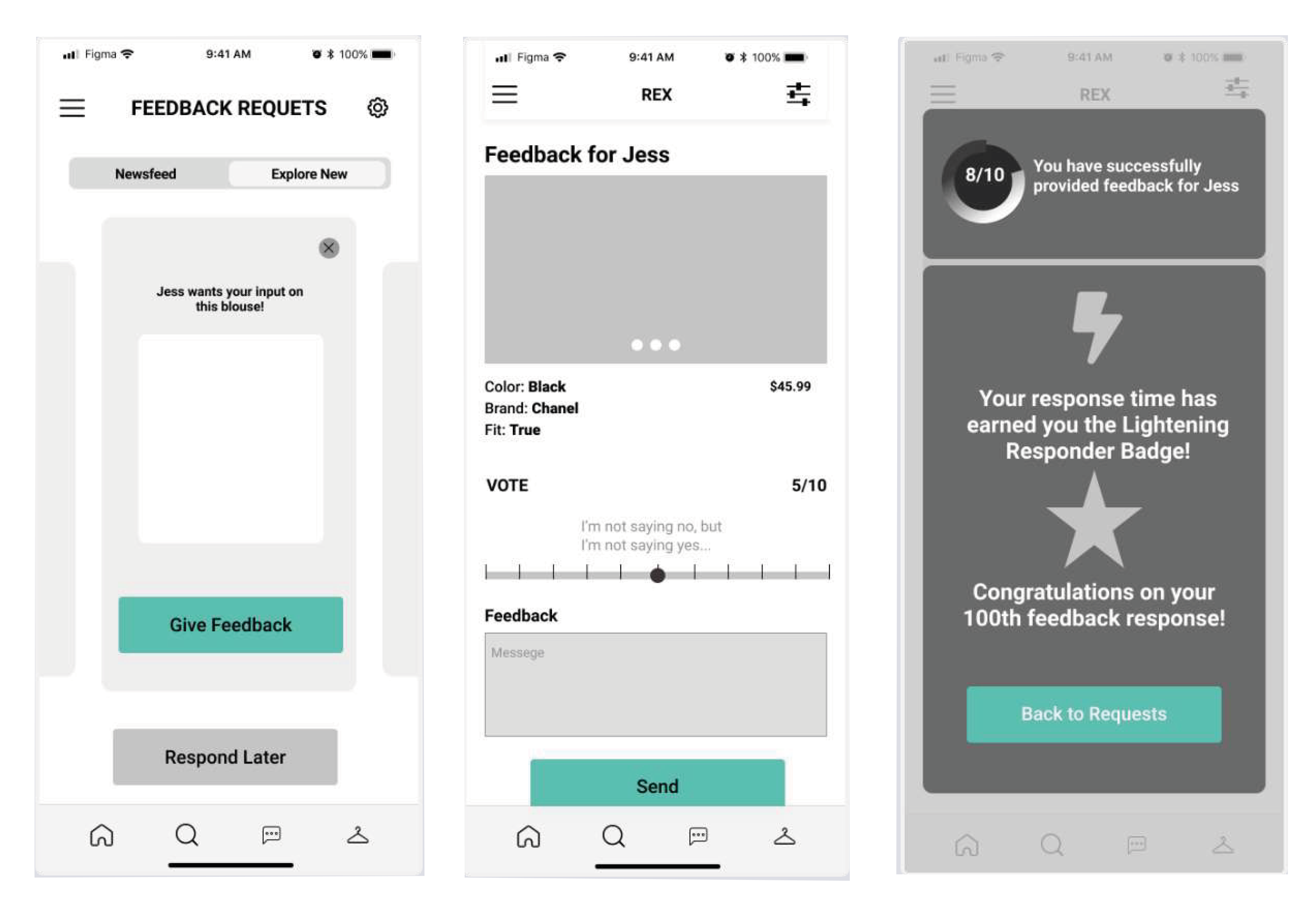
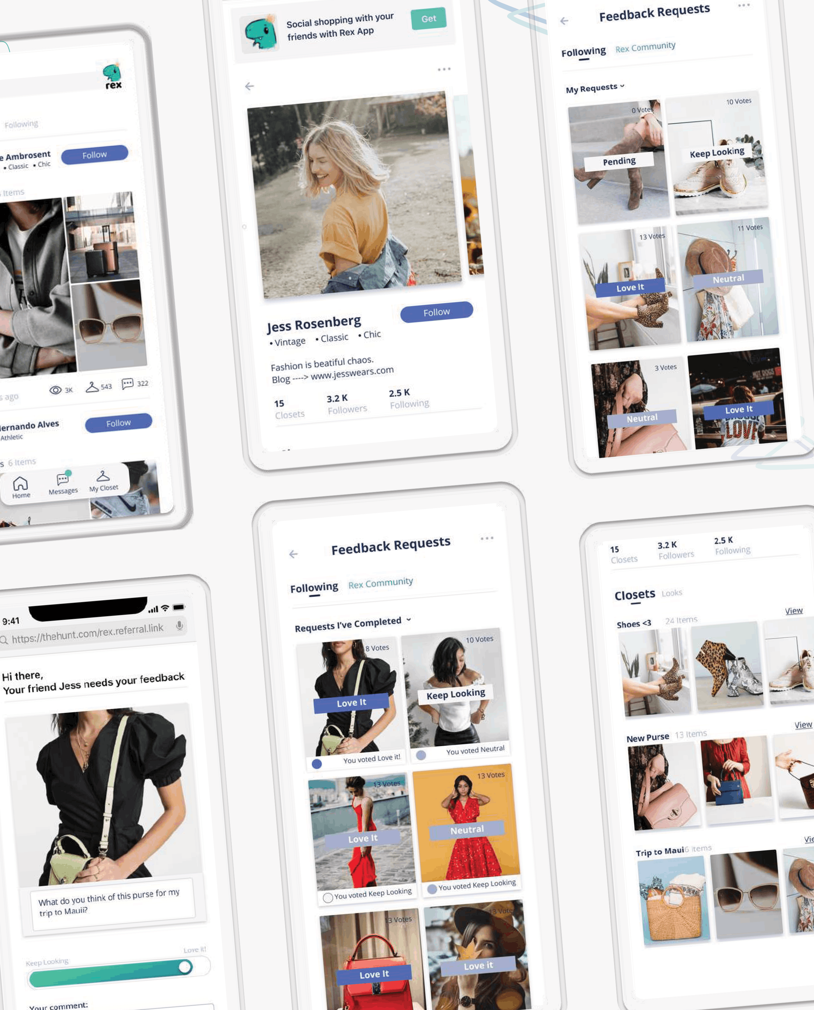
Prototype 2 and final validation
The second prototype directly addressed both concerns from round one. The 0-to-10 voting scale was replaced with a Keep Looking / Love It slider and an emoji-based quick response system, reducing the social friction of giving negative feedback. The feedback request flow was redesigned to integrate within a messages-style inbox rather than a separate module, making it feel more native to how users already communicated.
Usability test results from round two were significantly stronger. Participants described the experience as very intuitive and easy to navigate. One participant said "I would definitely use something like this," a direct reversal from the round one adoption concern.
Reflection
The REX project reinforced the value of research as a design tool rather than a validation step. The two most significant UI changes in Prototype 2, replacing numeric voting with emoji feedback and rebuilding the request inbox, came directly from usability testing, not designer intuition. Research surfaces issues users did not even know they had. The design system built in Figma and handed off through Zeplin gave the engineering team a single source of truth for implementation, reducing ambiguity across the development cycle.
Client Testimonial
"This case study documents work completed during a contracted UX design sprint with the REX team in 2021. Work is shown in a portfolio context with team attribution."
See my work
A selection of UX, brand, and design systems projects spanning enterprise SaaS, identity design, and research.