Keldorn Environmental Services — Brand Identity
About the Project
Keldorn Environmental Services is a small environmental and industrial services company operating in a field where credibility and professionalism are not just nice to have. They are essential for winning client trust and securing partnerships. When I came on board as a freelance brand designer, the company did not have a consistent or polished visual identity. Their materials varied in appearance and their logo did not reflect the level of professionalism behind the work they were doing.
The goal was not to make Keldorn look like a large corporation. It was to give them a brand that felt established, trustworthy, and versatile enough to work across every context their business operates in: office documents, field signage, vehicle wraps, uniforms, and future marketing materials. The identity needed to communicate strength and reliability without feeling cold or generic.
What I Did
The project started with a discovery conversation focused on understanding Keldorn's services, their target clients, how they wanted to be perceived in their industry, and what competitor brands looked like in the environmental and industrial services space. This research phase was critical for grounding the visual direction in something real rather than defaulting to generic industry aesthetics.
Three themes guided the concept development. The first was trustworthiness. Environmental and industrial services clients are making decisions with safety, compliance, and long-term reliability at stake. The brand needed to communicate that Keldorn takes that seriously. The second was environmental relevance. The identity needed to connect clearly to the environmental services space without leaning into clichés. The third was versatility. A brand that only works on a website or only works on a business card is not a real brand system. Every element had to function equally well across print, digital, signage, and uniform applications.
I developed multiple logo concepts exploring industrial and environmental themes, bold simple shapes for strong recognition at any scale, and color directions associated with trust, safety, and sustainability. Each concept was presented with rationale explaining the thinking behind it, giving the client a meaningful basis for decision-making rather than a purely aesthetic preference exercise.

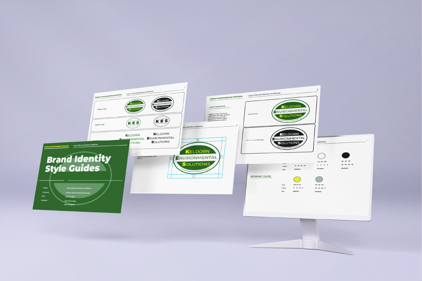
After selecting a direction through client review and discussion, I refined the logo through several rounds of feedback, adjusting proportions, weight, and color balance until the mark felt confident and complete. Once the final logo was locked, I built the full brand identity system around it. This included a defined color palette with primary and supporting values and documented usage rules for each, a typography system covering display and body hierarchy, spacing and clear space requirements for the logo, approved color variations for use on light and dark backgrounds, and prohibited use guidelines to prevent the brand from being misapplied in the future.
The final deliverable was a brand guidelines document consolidating every rule and asset into a single reference the company and any future vendors could use to keep the brand consistent over time. All final assets were exported in multiple formats covering print-ready vector files, screen-optimized formats, and transparent background variations for flexible use across any application.
The completed identity was fully adopted by Keldorn Environmental Services and is now the official branding used across their business materials.
See my work
A selection of UX, brand, and design systems projects spanning enterprise SaaS, identity design, and research.